💵 Is the Dollar really going to Collapse?
- White Oak University

- Apr 4, 2022
- 2 min read
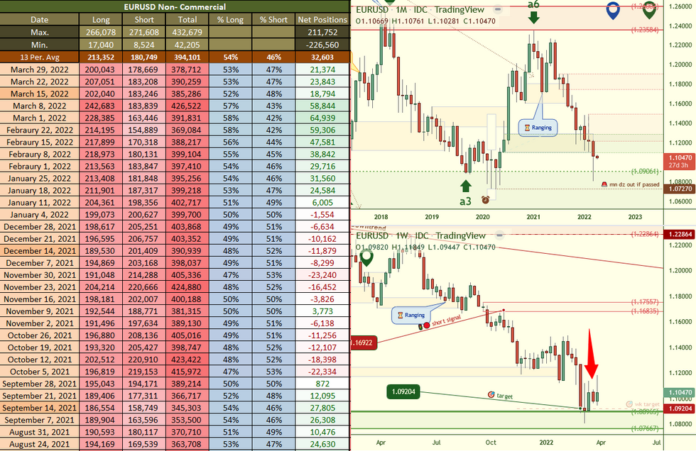
Based on the Commitments of Traders data reported on: March 29th 2022

#GOLD price dropped down from the highs and continued until the weekly demand zone was contacted. The weekly uptrend is not the strongest and therefore we could see this demand break easily and price decline even further. Notice the demand is not a dark green, therefore is not high quality.
On the 3 month chart, we have always mentioned how we had a 3 month bearish engulf that was formed and that we should keep an eye on that. Why? Because bearish engulfs typically signal a bearish move until a demand is contacted and with this chart only a switch zone was contacted. Notice the 3 mn demand is a darker green (I will play around with the colours to get them right) this means it’s an important zone within a trend.
$EURUSD the red supply zones has thicker distal and proximal lines indicating that this is the zone causing the major force, in this case to the downside. The demand zone within the range is lighter because with the current dynamic the bias is that this demand zone should be taken out. A signal that this demand will be removed with high odds is if price drops lower than the low made back in 2020.
#USD the weekly chart of the dollar has an uptrend, although not the highest quality trend the overall pressure is to the upside so the demand within this trend is darker as this zone is important and could be used to drive price higher should a drop in price occur.
🚨🏆 Win a FREE month tuition paid by us by following us on Twitter @WhiteOakFX and Retweet our links and SHARE our YouTube videos to continue getting them for FREE!
👇📺🚨 Watch a PREVIEW of what students receive 🚨📺👇


Comments